Showing posts with label walls. Show all posts

Wednesday, August 4, 2010

INTERIOR, part 2~

images via http://www.architecturesdesign.com


Lots of open space here; minimalistic feel; sloping ceilings


Beautiful woodsy naturalistic feel; love the white on wood scheme


Windows! :)


Modern, almost commercial feel; I like the colors and furniture and layout, but it's lacking a certain amount of homeyness.

INTERIOR, part 1~

images via http://www.architecturesdesign.com


Sunday, March 21, 2010

Photographers // Julien Lanoo :: House Nms

via Julien Lanoo Photography

These photos are a little overexposed but that's art i guess?


there's a closet i think!


fantastic glass wall! imagine how many birds crash into it each day! lol.


lots of white. cool light fixture above the table.


the only reason i like this picture is the cactus. its made me decide i need a cactus in my kitchen right now.


interesting cabinets. not sure if i like or not.

Feldman Architecture: part 1

Introducing Feldman Architecture, located a hop, skip, and a jump away in San Francisco.

images via:
http://www.feldmanarchitecture.com/
http://eyecandy-webcandy.blogspot.com/

just as a reminder, right click and "view image" will show a larger version of most images.


House Ocho:


Pierce Street Renovation:


Old Bernal House:


Buena Vista:


03.21

via http://www.1richtungsblog.com/


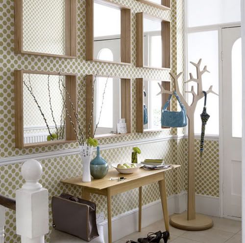
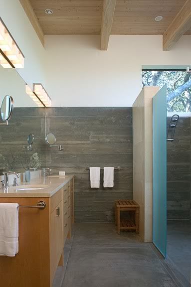
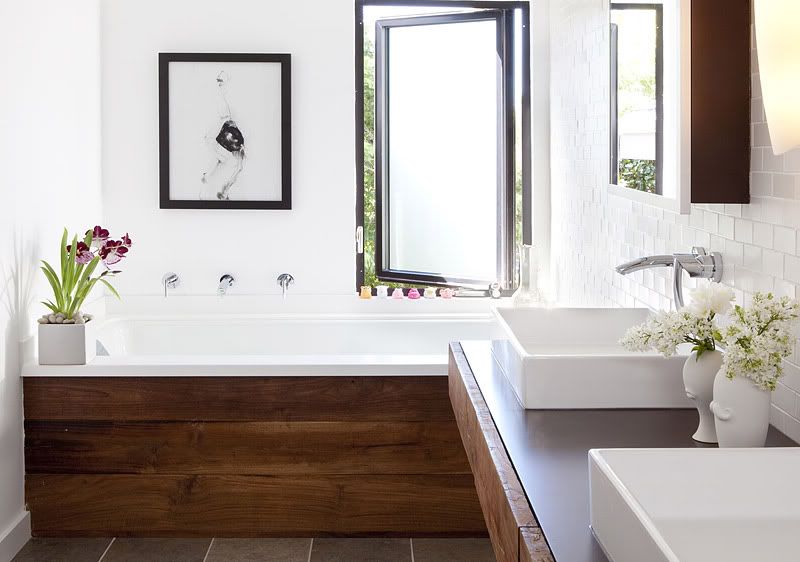
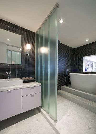
not sure why, but i like it. preferably more in a bathroom than a hallway tho. i think with any other pattern or any other color scheme it would be hideous. the mirrors break up that pattern really well too so that it's not toooo overwhelming.


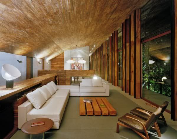
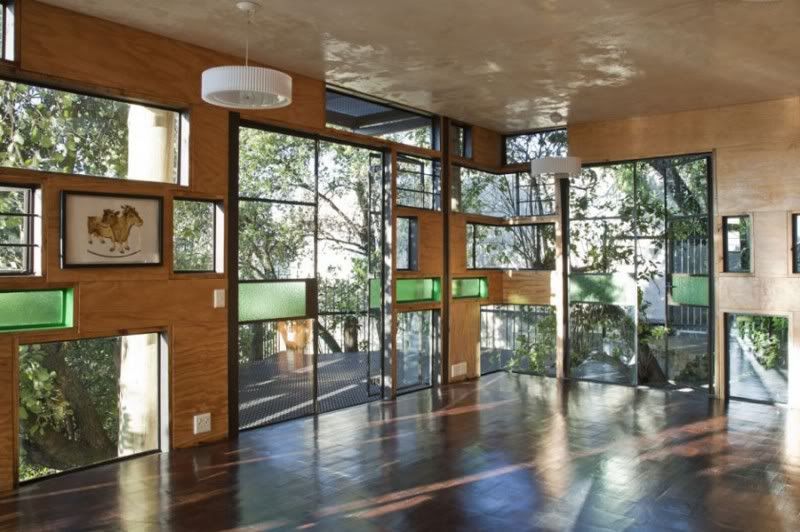
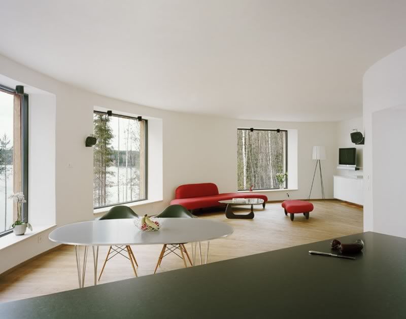
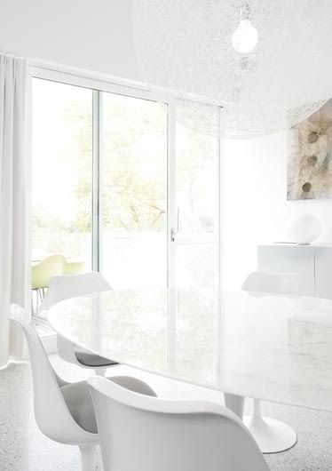
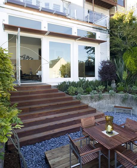
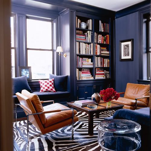
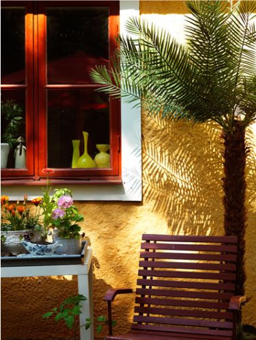
once again, i dont know why, but its pretty. (i think its the windows.)


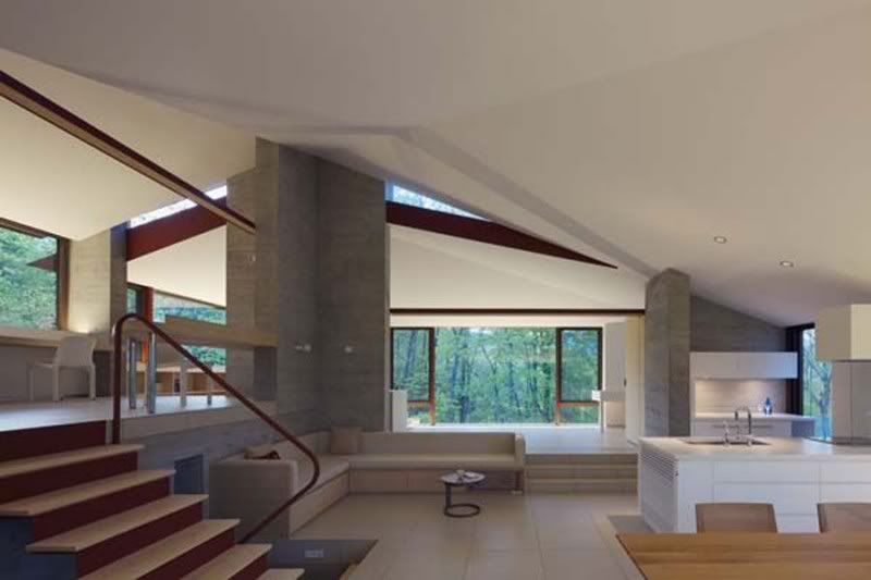
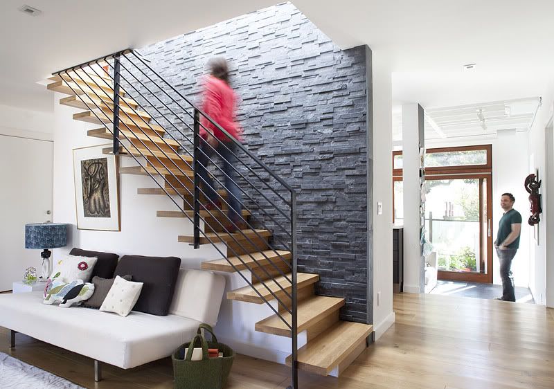
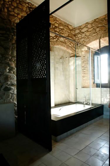
the woes of reposting something from another blog - you get all their edited-image-crap. it doesnt help when the blog is in another language. :/ (google gave me nothing on jimmy schoenning.) anyways, the image on the left is what i like. the stairs without an outside handrail or support underneath, and the two tone wall! nice!


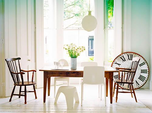
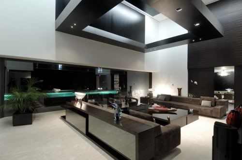
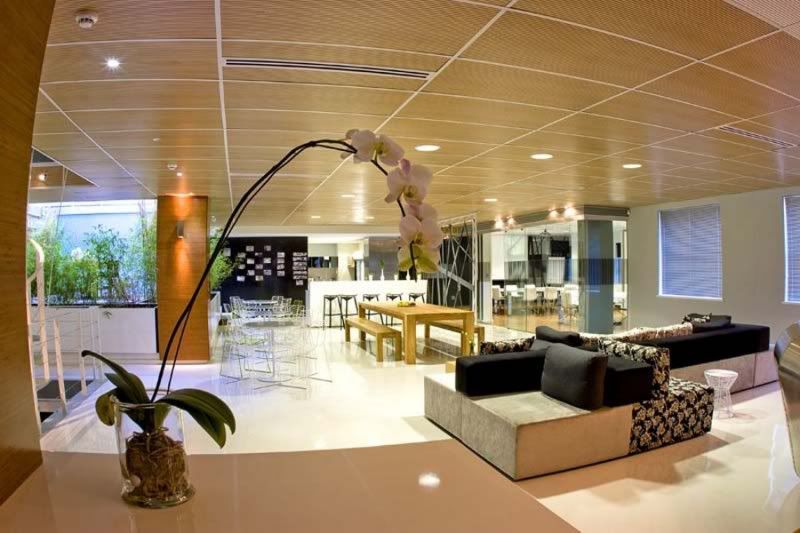
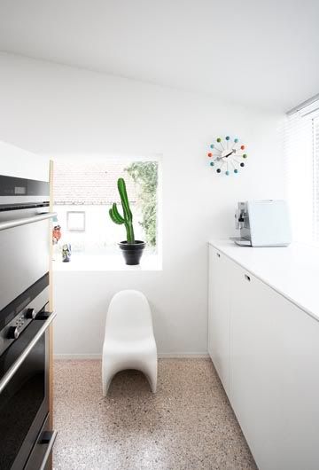
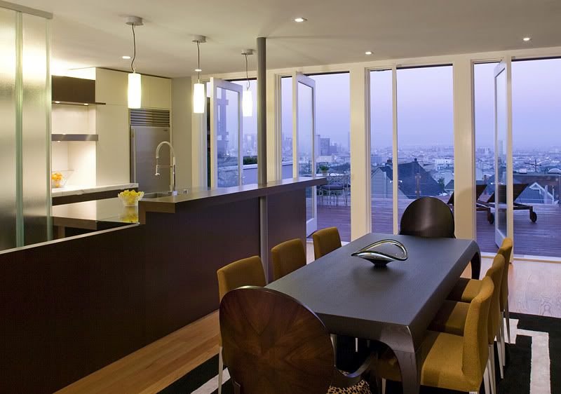
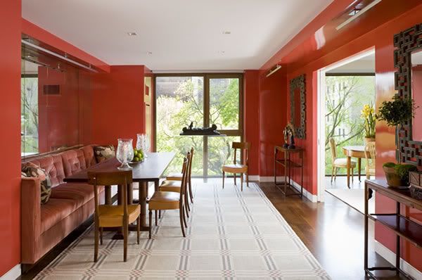
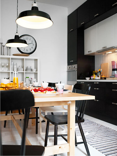
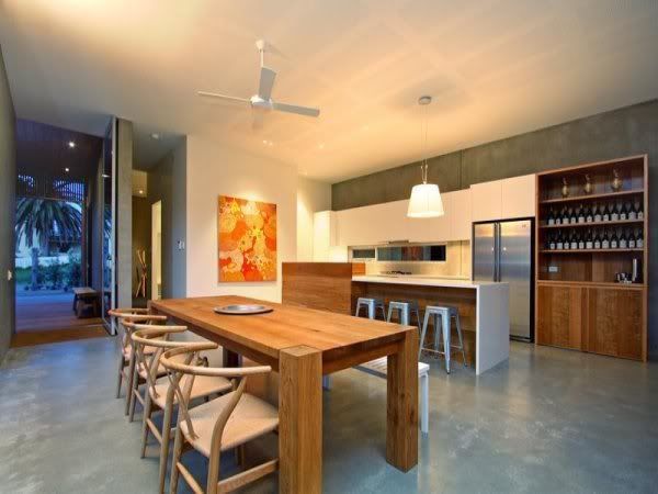
love love the color scheme, wooden table, giant clock. everything about this image i love!


a staircase going through the brick wall of a makeshift library??! wonky!!

Friday, December 4, 2009

TAR

source: http://www.desiretoinspire.net/blog/2009/12/4/todd-alexander-romano.html


i like the bench nestled next to the bookcase. the reading lamp is cute too. i like the deep rich navy of the walls and how it compliments the zebra rug, which i also like.


i think i really like the idea of huge rugs as opposed to carpet. hardwood floors can just look so much nicer than carpet. and if you get a rug, you can change it out and vary the feel of the room so much more easily.


can you guess? i like the plant lol. and the ceiling is neat. its a great contrast to the more kitschy feel of the rest of the room. interesting. i dont like the rug because its got that shape like it actually came from the animal. not a fan.

Titles are not always easy to think of

source: http://www.desiretoinspire.net/blog/2009/12/4/clive-tompsett.html


again the double-stacked high kitchen cabinets! much love! except i much prefer the colors and styles of this one. i like the modern look and the black color. i also like the clock for some reason; its very big and plain.


organized chaos! my favorite! and the shelvessss! you can put books and records and decorations in random empty shelves.


this image is very frustrating because i cannot pinpoint exactly what i really like about it, just that i really like it.


the color combination is very tropical and beachy. the palm tree helps too lol. i dunno if this is something i want on my house, but its neat.

Wednesday, December 2, 2009

Odd thoughts

sources:
http://www.desiretoinspire.net/blog/2009/11/30/beach-shack.html
http://www.desiretoinspire.net/blog/2009/11/27/erin-swift.html


i like the combination of regular white walls and concrete walls. unordinary in a good way.


i dont have a clue why, but i really like that wooden table. lol. and the single firey painting stands out by its singularity and bold color in an otherwise subtle room.


hanging chairs and pathway lights!

Interesting darkness

source: http://www.desiretoinspire.net/blog/2009/12/2/jan-luijk.html


gorgeous reading nook! rather dark and somber though; i dont know how long or how often i would enjoy it.


i dont like it as a whole, but it has some interesting ideas.


also here, i absolutely dont like the image as a whole, but the stone idea is interesting. probably gray stones if at all. and the black panel wall thing is kind of interesting.

Just ideas that are appealing on some vague level.