Monday, December 28, 2009

Sunday, December 27, 2009

Holiday Revival! :)

sources:
http://www.desiretoinspire.net/blog/2009/12/18/update-from-miguel-flores-vianna.html
http://www.desiretoinspire.net/blog/2009/12/21/lonny-magazine.html


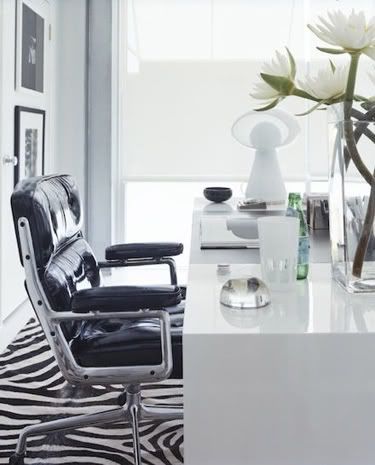
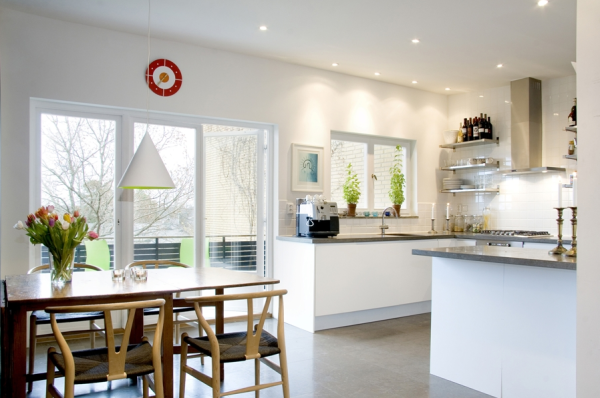
I love the contrast here. the white desk (and flowers) with the black leather chair. complimented with the combined black and while zebra rug. the walls are white, the framed photos are not color but b&w as well. very well put together. most of the color is from the plant which i enjoy aesthetically.


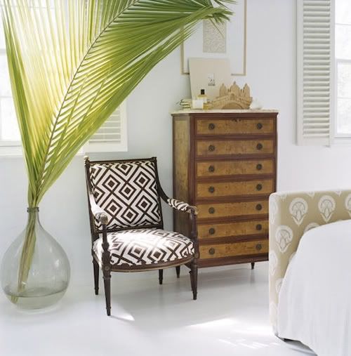
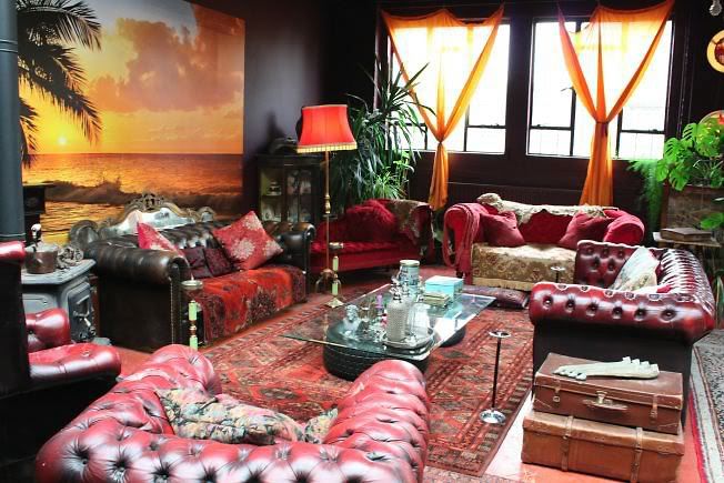
I really like the palm fronds. That's about it lol. the chair, imho, is really ugly haha.


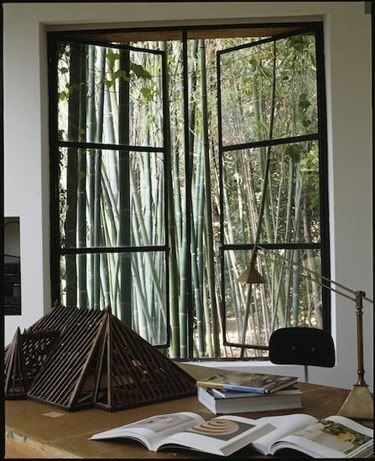
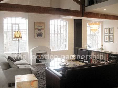
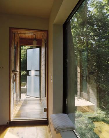
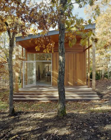
I like the big open windows, and I also really like the view. Kind of a secluded bamboo forest vibe going on (if that's even bamboo, I can't tell).


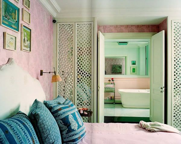
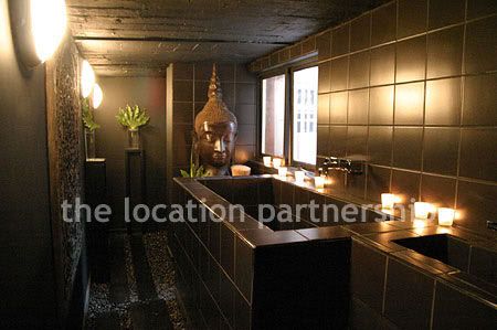
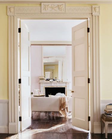
I like the panels on either side of the bathroom doorway. At first it looks like they see into the bathroom, but they're actually mirrors! Mirrors always make a room feel bigger, so I like how these are very non-obtrusive and decorative. I think they mighr even be closets too. (right click and view image to see a bigger picture.)


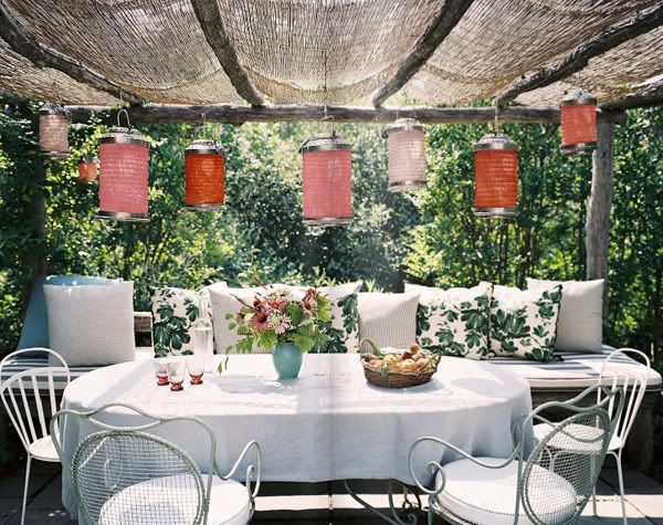
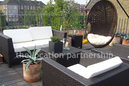
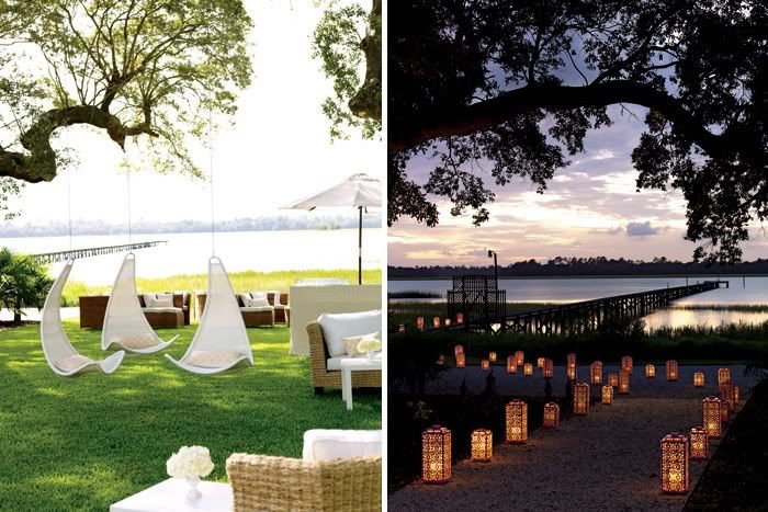
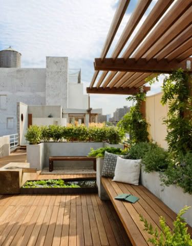
Besides the cushioned bench with all the pillows, I like the naturally enclosed feeling. The overhead material is very natural looking and I like the use of plants as a wall. More backyard (pool, etc.) can be on the other side of the foliage. Heated lamps or an outdoor fireplace could even make this comfortable in mild winter weather (wind, light rain, etc.) as well.


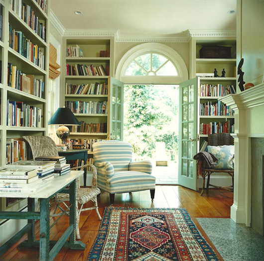
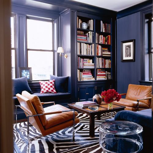
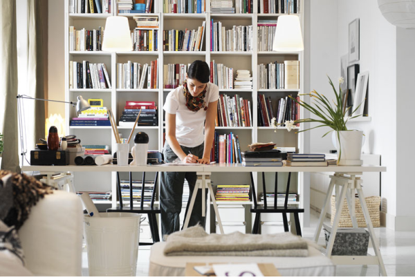
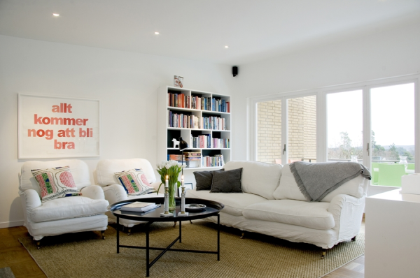
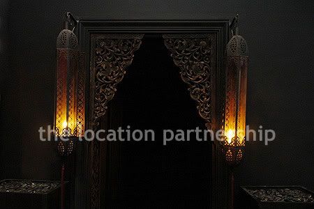
a faux library room with books ceiling to floor and breezy double doors is beautiful! (although my dream room is akin to the beast's library that belle finds in Beauty and the Beast. :3 )


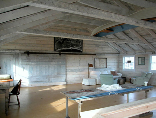
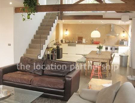
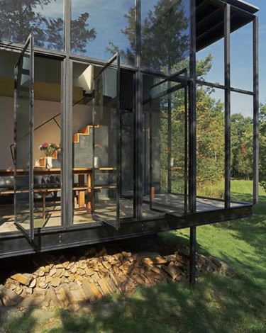
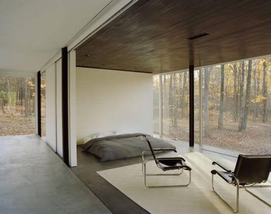
For some reason I feel like this would make a good loft. Kind of rustic and minimalistic. That looks kind of like a sliding doorway in the back but it would be nice to put a big window or even a tv nook behind it.

Friday, December 4, 2009

TAR

source: http://www.desiretoinspire.net/blog/2009/12/4/todd-alexander-romano.html


i like the bench nestled next to the bookcase. the reading lamp is cute too. i like the deep rich navy of the walls and how it compliments the zebra rug, which i also like.


i think i really like the idea of huge rugs as opposed to carpet. hardwood floors can just look so much nicer than carpet. and if you get a rug, you can change it out and vary the feel of the room so much more easily.


can you guess? i like the plant lol. and the ceiling is neat. its a great contrast to the more kitschy feel of the rest of the room. interesting. i dont like the rug because its got that shape like it actually came from the animal. not a fan.

Titles are not always easy to think of

source: http://www.desiretoinspire.net/blog/2009/12/4/clive-tompsett.html


again the double-stacked high kitchen cabinets! much love! except i much prefer the colors and styles of this one. i like the modern look and the black color. i also like the clock for some reason; its very big and plain.


organized chaos! my favorite! and the shelvessss! you can put books and records and decorations in random empty shelves.


this image is very frustrating because i cannot pinpoint exactly what i really like about it, just that i really like it.


the color combination is very tropical and beachy. the palm tree helps too lol. i dunno if this is something i want on my house, but its neat.

Thursday, December 3, 2009

Sweden

sources:
http://www.desiretoinspire.net/blog/2009/12/3/leslie-siegel.html
http://www.desiretoinspire.net/blog/2009/12/3/straight-from-the-text-book-on-swedish-houses.html


there's something about kitchen cabinets you cant reach that i kinda like.


very clean and sharp. mostly i like the plants and the lights on the ceiling.


bright, open, and cozy.

Image dump

source: http://www.locationpartnership.com/index.php


i love balconies that are kind of like a path along the outside of a room.


patio on the roof! i like the boxy black furniture. and i really like that cute plant on the table!


this is like a bridge thing upstairs that goes over the living room or some big room downstairs. i like bridges. :3


bathtubs. for some reason i like the aesthetic of the sharp-edged bathtub even though im sure its not the most comfortable tub ever.


this one looks more like a deluxe spa than a bathtub. *__*


ive decided i definitely want a zen bathroom. with like stones on the ground and ambient lighting and bamboo plants. hella like that doorway.


i just like the layout. and the kitchen table. damn i must have a thing for rustic rectangular wooden tables.

Wednesday, December 2, 2009

Um, wow.

source: http://www.desiretoinspire.net/blog/2009/11/5/how-much-is-too-much.html


the painting and the curtains match! um, otherwise, i dunno what to say. wow? wtf? lol?

Odd thoughts

sources:
http://www.desiretoinspire.net/blog/2009/11/30/beach-shack.html
http://www.desiretoinspire.net/blog/2009/11/27/erin-swift.html


i like the combination of regular white walls and concrete walls. unordinary in a good way.


i dont have a clue why, but i really like that wooden table. lol. and the single firey painting stands out by its singularity and bold color in an otherwise subtle room.


hanging chairs and pathway lights!

Little Things

source: http://www.desiretoinspire.net/blog/2009/12/1/melanie-acevedo.html


its pretty, but really why i saved this picture is the plant. how it looks like if you're sitting in the right seat you could accidentally brush it with your arm.


double doors! i dont necessarily like these, but it's a grandeur idea. perhaps leading into our mattress-floor room :)


i like how the curtains are two different, cheery colors.


the windows above the sink! birds could fly in while you're washing the dishes.

Interesting darkness

source: http://www.desiretoinspire.net/blog/2009/12/2/jan-luijk.html


gorgeous reading nook! rather dark and somber though; i dont know how long or how often i would enjoy it.


i dont like it as a whole, but it has some interesting ideas.


also here, i absolutely dont like the image as a whole, but the stone idea is interesting. probably gray stones if at all. and the black panel wall thing is kind of interesting.

Just ideas that are appealing on some vague level.

Windows

source: http://www.desiretoinspire.net/blog/2009/12/2/bilyana-dimitrova.html


i love the mini hallway, the fogged glass door, and the big window. perhaps the way to the backyard.


woodsy back patio. i can totally see it looking out into a forest with the overrun gazebo and bench.


if the ceiling is tall, the windows double but with a break. lots of light, lots of white. the column adds some grandeur. the tall ceilings make a small space feel much bigger and more open, esp coming from the room on the right with a much lower ceiling.


the windows! completely open with a drop beneath, and hidden firewood. also, the end space on the right actually looks open and glassless with a doorway leading out. beautiful! we definitely need to occasionally hire a window cleaner for this house tho lol.


omg. beautiful place to read or nap. the pillows are necessary for the aesthetic. and definitely the climbing plants and the foliage.


low bed. wooden ceiling?! *u* concrete floors?? glass walls that look out to a forest! hella minimalistic but somehow i really really enjoy the aesthetic created here. hmmm.

Nature

source: http://www.theselby.com/9_21_09_DanM_Shannan/index.html


a beautiful wooden bench in nature. great place to read a book or nap or day dream with a puppy. :3


an overgrown, abandoned looking gazebo


a small gate for an overgrown path. our dogs could probably jump over it


a very open, but very low loft. you could jump down from it on a brave day. and if someone fell off, they would be okay. still high enuf to stand under tho.


it is impossible to have too much silverware! and they can be any direction, not just straight up and down. and the wodden partitions appear to actually be part of the drawer.